40 Simple Frame and Line Ideas for Kawaii Journaling Pages
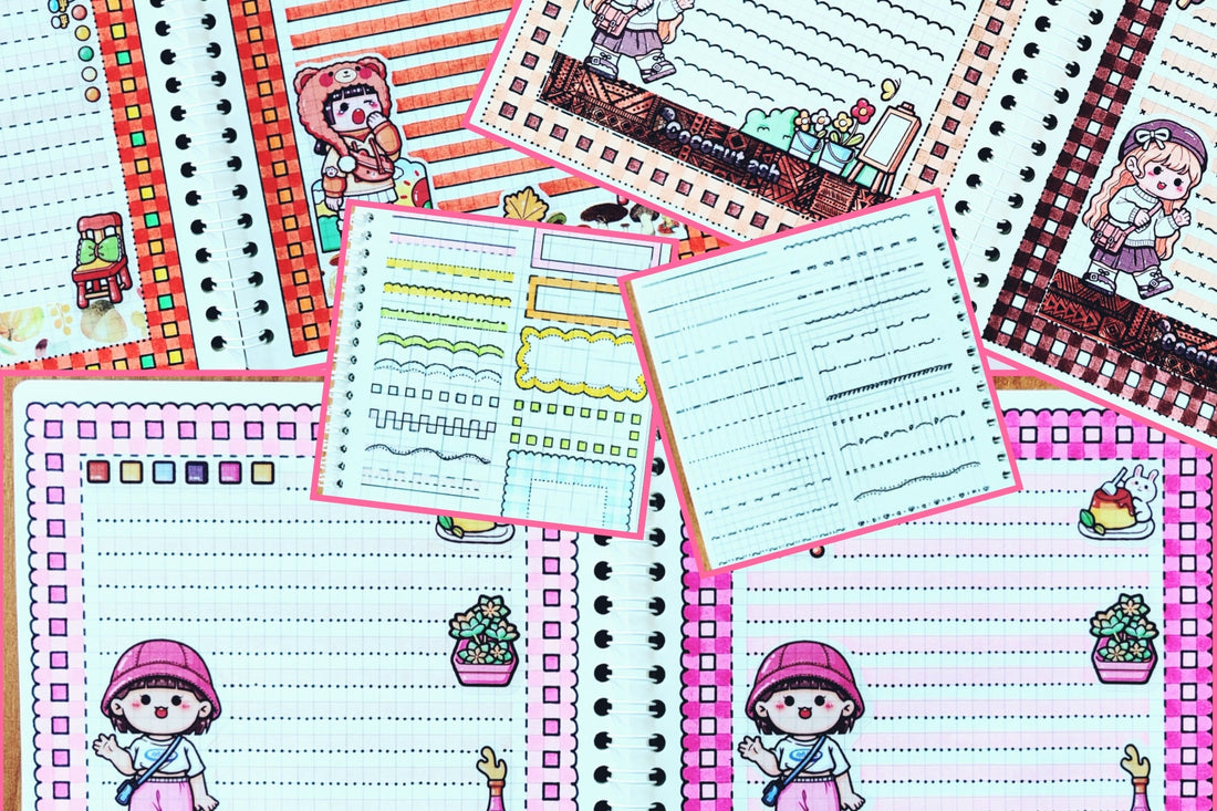
In this master class, you'll find examples of simple frames and lines to use in your kawaii journaling pages.
These frames can also serve as lines for notes. A simple frame or line can be straight or made up of various geometric and other elements. It doesn't require a coloured marker; it’s best to draw it with a black liner or gel pen, but feel free to experiment with coloured pens as well. A black liner is usually the best option, adding a clean finish to your collage. When choosing the thickness of your liner or pen, consider the decorative elements (like stickers) you’re using.
Visually assess the thickness of the black lines on them. For most collages, I recommend using a 0.6mm black liner, though sometimes a 0.4mm liner works better, and occasionally, other thicknesses may be needed. You can hand-draw the frame or line for notes, but for precise arrangement of elements, using a ruler can help. If you want to get more creative, you can even try a ruler with templates for various designs. The photo shows examples of simple frames and lines for notes, but feel free to come up with your own. Look at the possibilities and start drawing!
COMPLEX FRAMES AND NOTE LINES

Consists of one or more lines drawn with a coloured marker. The lines can be straight or take on various shapes. The frame is usually decorated with a black liner on both sides, but it’s also acceptable to decorate just one side (either outside or inside). Occasionally, a pattern is drawn with a black liner over the coloured marker line.
Which frame should you choose for collage decoration? Look at your stickers and visually assess which geometric elements dominate (straight or curved lines, circles, squares, polygons, etc.). Use this to help guide your decision.
SIMPLE NOTE LINES

Drawn with a coloured marker. It can be straight, curved, or broken, and should be decorated with a black liner/pen only at the bottom (to avoid interfering with your future notes).
You can draw this line by hand, use a regular ruler, or a ruler with templates.
You can draw this line by hand, use a regular ruler, or a ruler with templates.
The choice of line style for notes follows the same rules as for creating a frame – just take a look at your stickers! However, a straight coloured line is always a reliable option.
IN SHADES OF PINK
- 1: Balanced and Harmonious Kawaii Journal Layout
- A light pink frame with dark pink squares stands out and looks polished, with three black line styles.
- Stickers are placed in a circle inside the frame, spaced well and not blending with washi in similar shades.
- Note lines use a pale purple-brown marker with a black pattern that doesn’t blend into the frame.
- Each element works on its own and fits well together as a whole.

- 2: When the Kawaii Journal Elements Compete Instead of Complement
- A dark pink frame with light pink squares blends into the stickers.
- Sticker placement feels crowded and overlapping.
- Washi tape and note lines blend together.
- The overall layout looks unbalanced and unclear.
IN SHADES OF ORANGE
- 1: Balanced and Harmonious Kawaii Journal Layout
- A dark orange frame with multi-coloured squares matches the sticker colours, outlined with two black line patterns that don’t blend in.
- Stickers are placed in a circle inside the frame, spaced well and don’t blend with the washi tape, leaving space for notes.
- Note lines are drawn with a pale brown marker and outlined with a black pattern, avoiding blending with the frame.
- Each element works individually and fits together well as a whole.

- 2: When the Kawaii Journal Elements Compete Instead of Complement
- A dark orange frame with similar-coloured squares and one black line pattern blends with the stickers.
- Stickers overlap and blend together.
- Washi tape gets lost in the colourful background.
- Note lines use the same colour and black line pattern as the frame, causing them to merge with other elements.
- The overall layout feels unbalanced and chaotic.
IN SHADES OF BROWN
- 1: Balanced and Harmonious Kawaii Journal Layout
- A light brown frame with dark brown squares and three black line patterns doesn’t blend with the stickers.
- Stickers are placed in the corners inside the frame and on the washi tape, leaving space for notes.
- Dark washi tape stands out as a decorative element but still complements the rest of the collage.
- Note lines are decorated with a black line pattern, different from the frame design.
- All elements are well-coordinated and harmonize together.

- 2: When the Kawaii Journal Elements Compete Instead of Complement
- A very dark brown frame blends with the dark washi tape and stickers, losing contrast.
- The black line patterns and light brown note lines don’t fix the issue.
- Note lines with black patterns may interfere with readability.
- The overall layout feels like a “solid dark spot.”
CONCLUSIONS AND TIPS:
- It is better to use two or more colours to decorate the collage.
- If you have chosen only one colour, then use as many different black lines-patterns as possible for decoration, and do not glue the collage elements too close to each other.
- When choosing a colour for drawing a collage, focus on the colour scheme of the stickers.
- Decorating with a black liner is a must if you have chosen markers of the same shades as the colour of the selected stickers.

- Do not use too much dark colour when creating a collage, otherwise you risk not seeing the rest of the decorative elements against each other.
- When choosing washi tape for decoration, make sure that it harmonizes with the colours of the stickers. Practice.
- Lots of practice. And you will succeed!!
See more kawaii journaling pages, layouts, and inspiration from the
artist behind this collage.
Recent posts

 Kawaii Journaling Made Easy: Step-by-Step Guides
Guest Creator: Tatiana's Masterclass on Making a Busy Style Journal Page Layout
 Kawaii Journaling Made Easy: Step-by-Step Guides